Ozobot EditorBrand for a Coding Platform
Years of features bolted onto the Editor, rebuilt into one consistent workspace that finally looks like Ozobot.
01The Problem
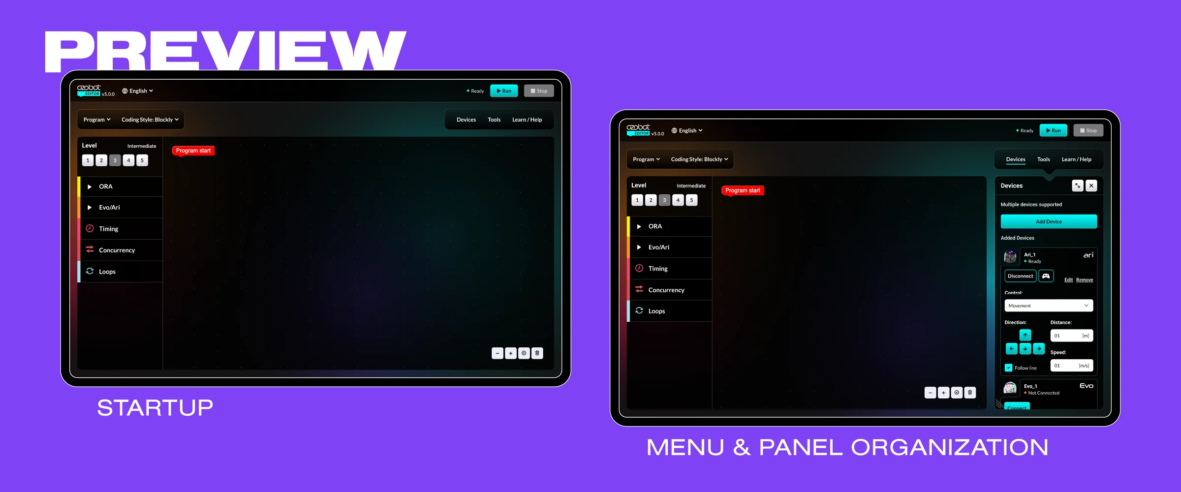
The Ozobot Editor (Blockly) is where students code Ozobot robots in blocks, and it was around long before I joined. Every robot, block category, and tool sat in one long menu, and Python lived on its own screen with no connection to the block-based code.
Over the years, new features were added wherever they fit, each with its own buttons, menus, and spacing. The Editor still worked, but it no longer looked like one product, or like Ozobot.
02Role & Scope
An outside design consultancy designed Editor v5, and two software engineers are building it. My part is the review: I go through the UI and UX as it develops and adjust the overall design so its layout, colors, and look line up with the Ozobot brand.
- Role
- Creative Director
- UX & Brand Review
- Time Frame
- 2026 – Ongoing
- Team
- Creative Director (me)
- VP of Product
- Design Consultancy
- 2 Software Engineers
03The Idea
Give the Editor a look of its own while keeping it unmistakably Ozobot. It's where students actually code, so it should feel like a place made for coding, with one set of rules for every button, panel, and block instead of a patchwork.
04Design
Its Own Look, Still Ozobot
In review, my focus was the brand: making sure the new layout, colors, and overall look feel like their own thing while still clearly belonging to Ozobot. Version 5 keeps block categories on the left, color-coded by robot and concept, moves devices, tools, and help into panels on the right so the canvas stays clear, and adds a Python Preview so students can see the code their blocks write as they build.
05In Progress
Editor v5 is still being built, so this story isn't finished. Once it's in students' hands, this page picks up with the Editor in the wild, what changed, and what I learned.
Tools — Figma (review)