Ozobot.comBrand & Marketing Site
Two sites became one, so schools can explore the robot, preview its lessons, and buy it, all on the same page.
01The Problem
Ozobot had two websites: one with detailed product features and resources, and a Shopify store where you could actually buy the product. Teachers and administrators deciding what to buy had to piece the story together across both, and the page where the purchase happened had the least to say about why.
02Role & Scope
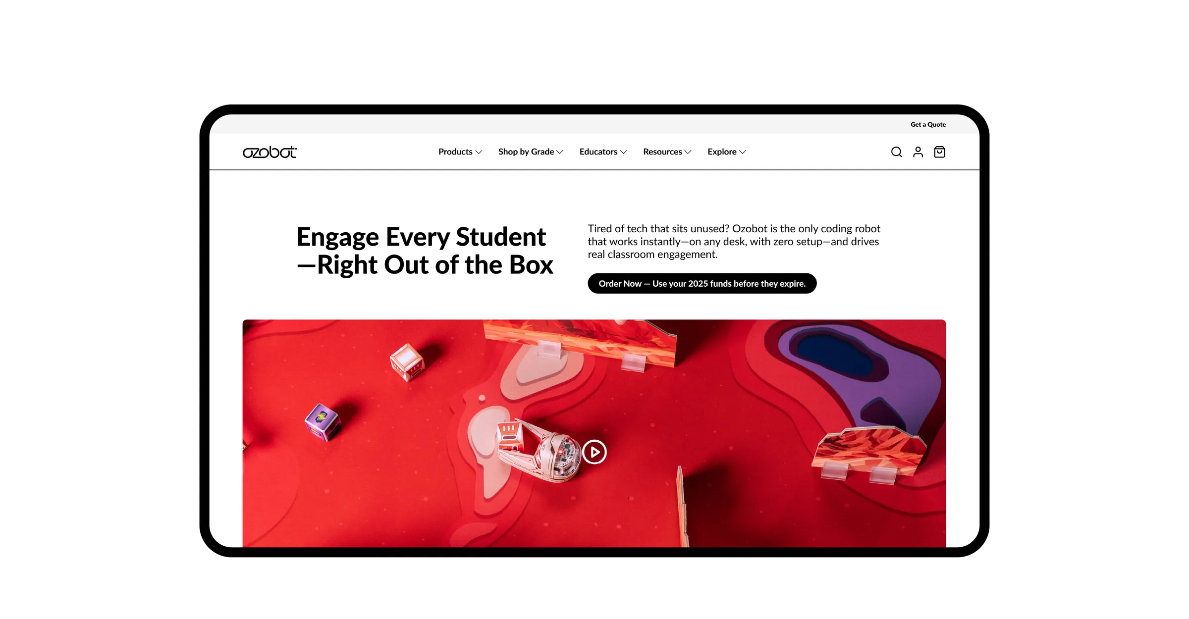
Ozobot's robots sell best when people can see them in action, so I led the rebuild into one site built around product and lifestyle photography and video. The work covered the homepage and collection pages, every robot and supporting product page, the mega menu, the cart, and the footer, across desktop, tablet, and mobile.
- Role
- Lead Product Designer
- UX/UI Designer
- Time Frame
- 2026 – Present
- Team
- Lead Product Designer (me)
- VP of Marketing
- Graphic Designer
- Developer
03Discovery
Education products aren't so different from other consumer products. People want to see the product in action. Administrators and teachers also want to see the lessons that make it worth the budget. And the site had two audiences: schools deciding what to buy, and customers who already own a robot and want to learn more about its features and lessons.
04The Idea
Make the content the sales pitch. Every product page shows the robot in action, what it can do, and how students program it, right beside the way to buy it. A few sample lessons in subjects like math, science, and AI show what's possible, while the full library stays in Ozobot Classroom. The brand identity steps back to frame it all.
05Design
Organizing a Lot of Pages
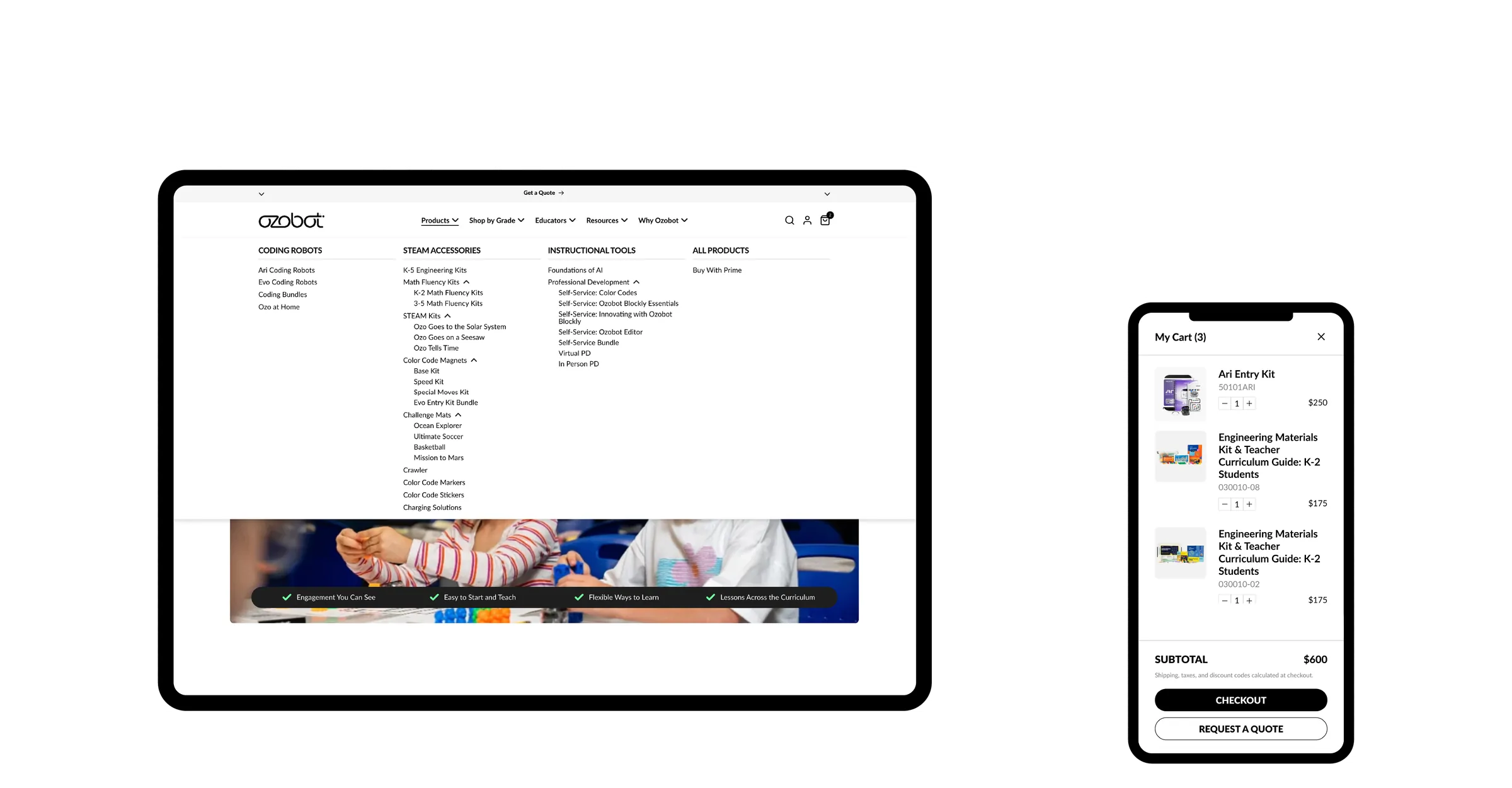
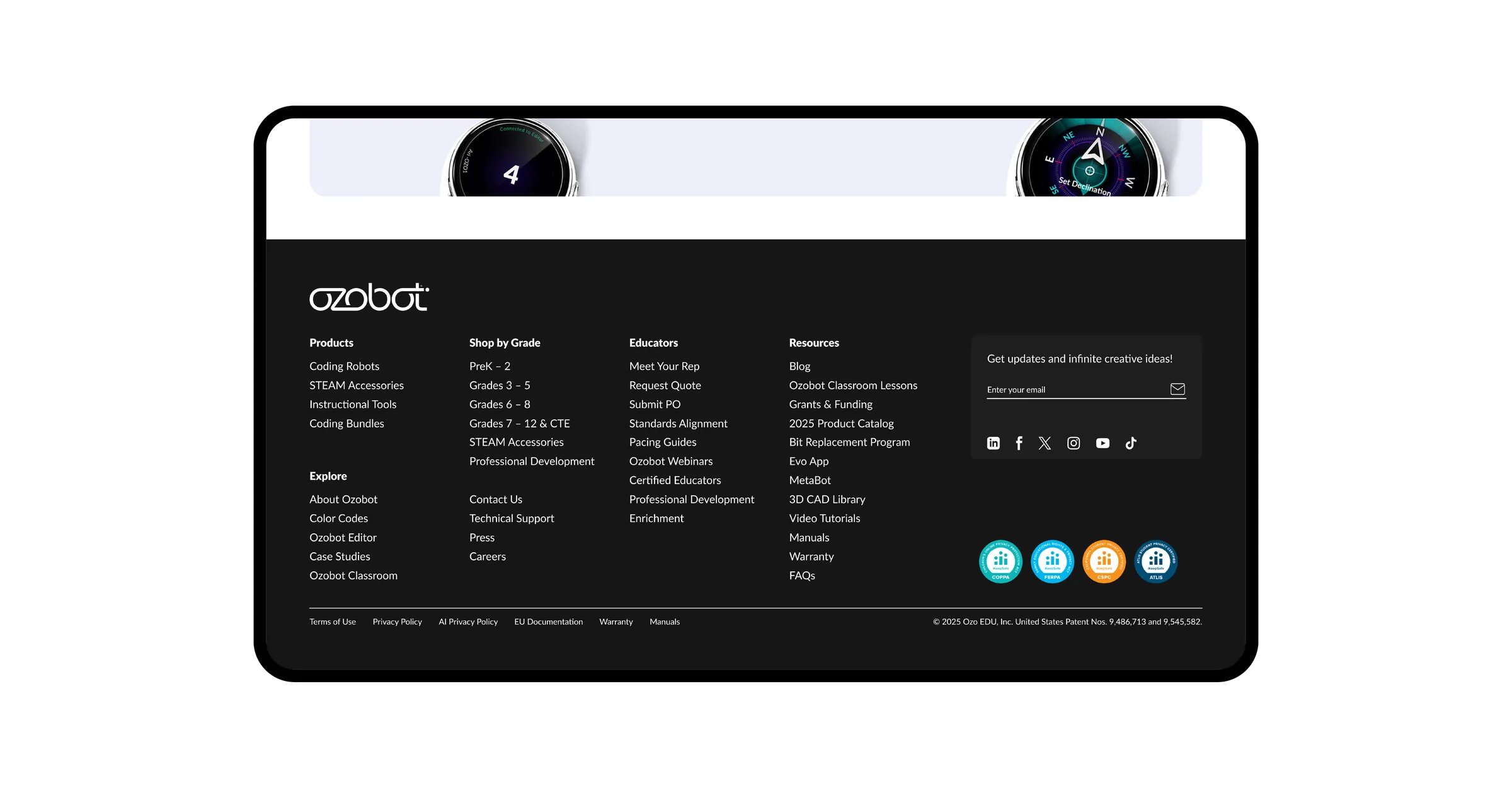
With every robot, kit, grade level, and resource under one roof, the site had a lot of pages, so organization came first. I mapped every page into five menus, Products, Shop by Grade, Educators, Resources, and Explore, and the footer repeats the same map, so nothing is more than a click away.
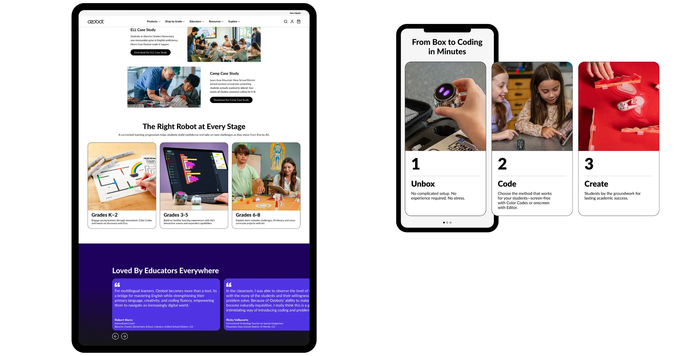
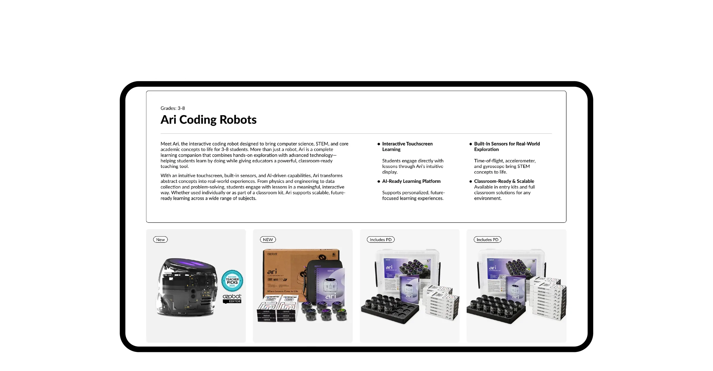
From there, the homepage sorts every robot by grade level, and every product page follows one template: photos and video up top, with the lessons, standards, and what's in the box right beside the price.
06In the Wild
The site as it shipped, from the homepage hero to the cart, on desktop, tablet, and mobile.
07Impact
- 2 → 1Sites Merged Into One Store
- 40+Pages Organized Into Five Menus
- 1Template for Every Product Page
The new site has been live for two months, so traffic and sales results are still coming in.
08Reflection
What I'm proudest of is that a teacher and an administrator can land on the same product page and both find what they came for, the lessons that make the robot worth teaching with and the photos and videos that make it worth buying. Merging two sites sounds like a technical job, and it was, but it really came down to deciding that the content was the sales pitch.
Tools — Figma, Adobe Creative Suite